PROFESSIONAL BRIEF : GROUND
BRIEF
In this module, you will undertake a professional brief for a
‘client’. You will interact professionally with the ‘client’ and endeavour to meet the client’s requirements. The ‘client’ will be the module leader and you will be firstly asked to submit a proposal for a brief of your choice. The module leader will then approve and keep a copy of the brief and will use this in regular interactions when discussing the progression of the brief and the required outcomes.
You will be required to record the meetings with the client, which will included issues discussed, recommendations of amendments and approval of ideas to be continued and further developed. Upon completion of the brief, you will be required to make a presentation to the client and to your peers before submission.
This project was done half in Bristol and the rest in Amsterdam as that August i sold all my possessions and left the UK with a laptop, a bass guitar and a cajon with a rucksack full of clothes. I had some 6 weeks of negative events and so i felt it was time to be in a neutral place. In some ways i reflect on the subject of the project and it seems to coincide with my life. Subconscious influence and all that. ;). I still to this day beleive this project:Ground could be a thing.
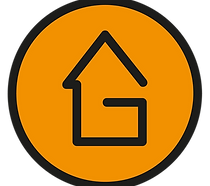
HOW GROUND WORKS


FEEDBACK
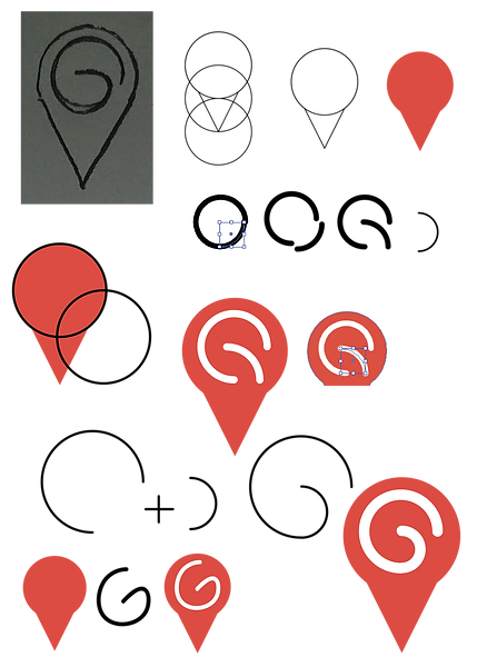
My tutor who was acting as a client gave me feedback on my ideas for the logo. My intention was to suggest a sense of progression, location whilst suggesting a sense of grounding: a new foundation and surroundings. I felt that the pin symbol in Google Maps was useful and due to its common use and popularity, this icon would be immediately recognizable and therfor catch the attention of anyone viewing it.
I was encouraged to continue with the google map pin icon yet i was still to find a typeface for body copy and also the logo itself, more importantly the G inside the red pin.
rejected

DEVELOPMENT


STRAPLINE

semibold
BODY COPY
SEGOE UI LIGHT
ABCDEFGHIJKLMNOPQRSTUVWXYZ
abcdefghijklmnopqrstuvwxyz
1234567890
!"£$%^&*()_+-=[]{};'#:@~\|,./<>?
SEGOE UI SEMI BOLD
ABCDEFGHIJKLMNOPQRSTUVWXYZ
abcdefghijklmnopqrstuvwxyz
0123456789
!"£$%^&*()_+{}:@~<>?|[];'#,./\
SEGOE UI CURSIVA
ABCDEFGHIJKLMNOPQRSTUVWXYZ
abcdefghijklmnopqrstuvwxyz
0123456789
!"£$%^&*()_+{}:@~<>?|[];'#,./\
SEGOE UI NEGRETA CURSIVA
ABCDEFGHIJKLMNOPQRSTUVWXYZ
abcdefghijklmnopqrstuvwxyz
0123456789
!"£$%^&*()_+{}:@~<>?|[];'#,./\
Cafe ADVERTISEMENTS

Spreading the word
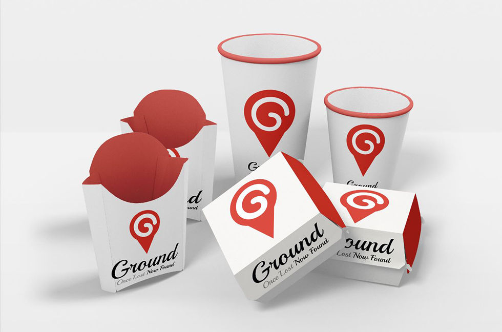
Food is something all homeless people come to terms with when their money troubles get the best of them. Table A5 displays can be used to generate the awareness of Ground. Posters outside cafes also do this. To strengthen this co-association i have created branded packaging for those cafes who wish to donate food to the homeless. The packaging resembles those of McDonald's and burger king which is a well known established company.
Any food item can be stored in these sets of packages and can be produced at a low cost for Ground.
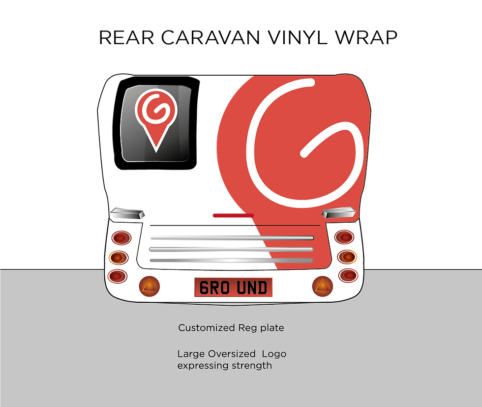
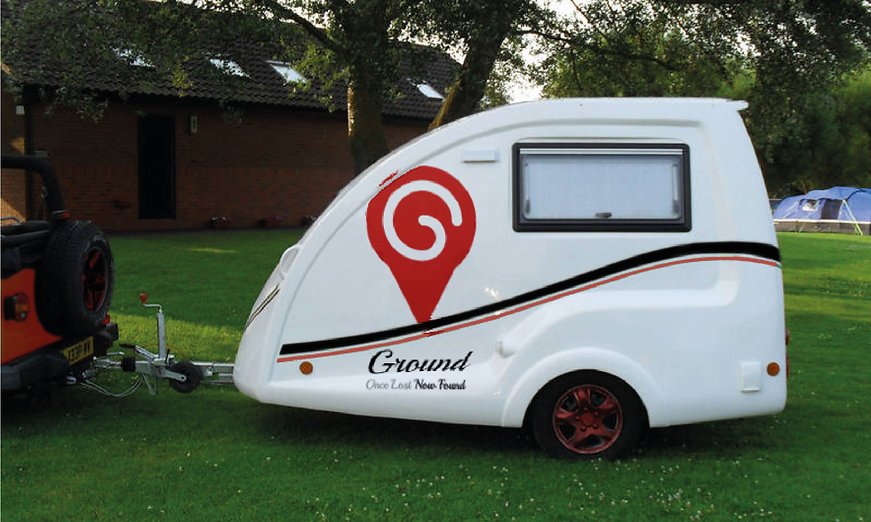
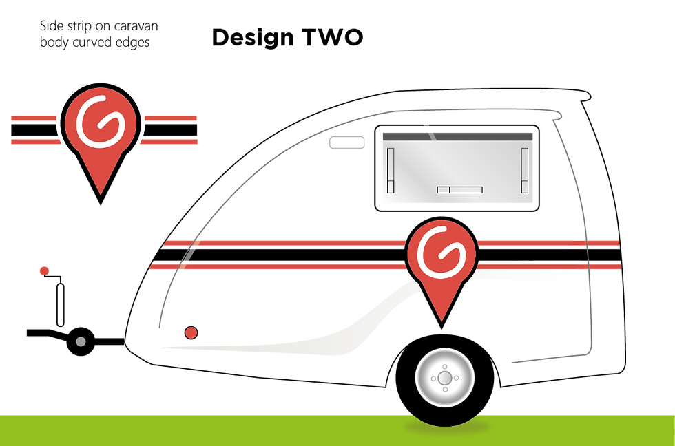
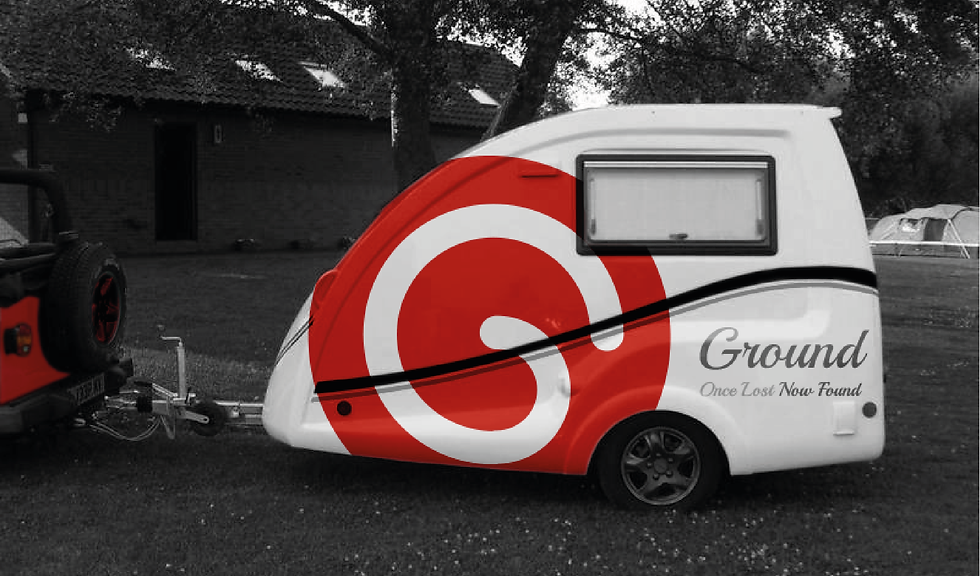
caravan concepts

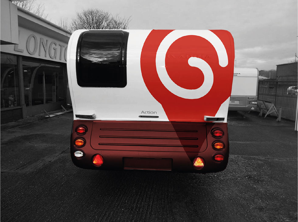
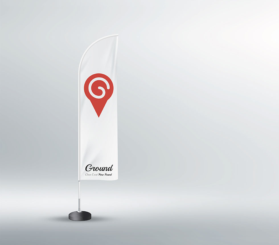
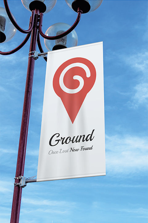
Grounds Signage
These are two examples of signage on the grounds of the caravan field and at the entrance. However in real life i wouldnt want any advertising done at the entrance as the field is full of vulnerable people who would more than likely wish to have comfort, peace and quiet due to their life complexities.
The exhibition flag could definitely be used in networking events where promotional work is being carried out.
TRIFOLD LEAFLETS
Raising awareness even more...
These will be placed in events promoting community based projects. Tri folds are still around today, which i noticed are present in many pubs around the cotswolds when out walking in stroud, Wotton under edge, street, Glastonbury.
These images used on the leaflets will be used for 48 sheet billboards too.


Photographic tone of voice
My photographic colour pallet of Red and grey scale uses a high contrast tone. Grainy and textured looking, this enhances the feel of homelessness.
My mockups for the black and white photography was achieved using Adobe Photoshop cc2019 consisting of perspective warp feature and blending modes ''if grey'' combined with displacement maps to create a more realistic overlook feel.
ONE MORE PERSONS LIFE TRANSFORMED
Remember when i shown you how Ground works?
Each homeless person who goes through the 12 weeks program living in the caravan pods will not only have their lives transformed, but for every story told, there will be a logo stencil (sprayed) onto the building.
This is where the agitation of the council comes in. The approach to ground has a 'banksy' kind of attitude mixed in. The logo on the buildings attracts attention from both the council and the newspapers which in turn gets the word spread far quicker plus not forgetting the passers by on the streets who may curiously gaze at the logo and ponder on its meaning.